
It has been common knowledge for quite some time that Google, amongst other companies, have a great influence on events. A group of researchers have recently developed a theory which states that Google Trends allow to predict the present. You must ask yourself, how can we predict the present ? The idea is to use Google Trends from previous weeks or months and see if those trends give us a good representation of what is happening right now. We decided to use the method behind this theory to pursue a project of our own.
First of all, we decided to study the link between initial claims for unemployment benefits and specific google trends. This example was presented in the original paper but we decided to view the data on another type of figure to give us another perspective and to push the analysis further by applying the method on another time scale.
The aim of the second part of our project was to study how Google Trends allow us to forecast near-term values of economic indicators, the US dollars/euro rate in our case. Google Trends are widely used in economic studies since the principal advantage is that Google search data is easy to acquire and provides economically significant improvements in forecast performance. The latter is of particular interest to central banks and other government agencies. Some time period are of particularly interest to us, especially the 2007 recession period. Indeed, it is quite obvious that the economic indicators changed radically during this period, but it would be even more interesting to see if Google Trends of weeks/months preceding this period could predict the change in those economic indicators. To help us on our project, we relied on a similar project which allowed us to have an overview of the Google Trends we should favor.
Structure:
This page is structured in three sections:
Index
1. What are Google Trends
Google Trends is an online tool that helps users visualise and discover trends in people’s search behaviour. It will not only allow users to see what topics and queries have been popular in searches but will also give access to data containing how often specific searches have been made over a certain period of time, that you can specify in the filters. The data can then be visualised by Google, producing a trend graph of the searched topic over the selected amount of time, allowing you to efficiently analyse the results.
1.A. What does Google Trends measure anyway?
From the FAQ of Google Trends:
Each data point is divided by the total searches of the geography and time range it represents to compare relative popularity. Otherwise, places with the most search volume would always be ranked highest. The resulting numbers are then scaled on a range of 0 to 100 based on a topic’s proportion to all searches on all topics. — Google Trends FAQs
So, it allows us to display interest in a particular topic from around the globe or down to city-level geography. for each word in your search Google finds how much search volume in each region and time period your term had relative to all the searches in that region and time period. It’s anonymized (no one is personally identified), categorized (determining the topic for a search query) and aggregated (grouped together). After entering your desired topic, you will be presented with these four refinement options, which will allow you to further scrutinise and fully explore the results. These are:
- Location: Possibilities range from global level to city level
- Timeframe: Options go as far as 2004, up until the last hour
- Category: Options include Arts & Entertainment, Sports, Politics, Finance, News etc.
- Search Type: Image Search, News Search, Google Shopping and Youtube Search
It combines all of queries into a unique measure of popularity and scales their values across the topics so that the largest measure is set to 100. Indeed, it does not tell you exactly how many searches occurred for your query but gives a nice approximation.
1.B. The rise and fall of blu-ray
We will take a simple example to illustrate the previous section and show how Google Trends are strongly connected to our present.
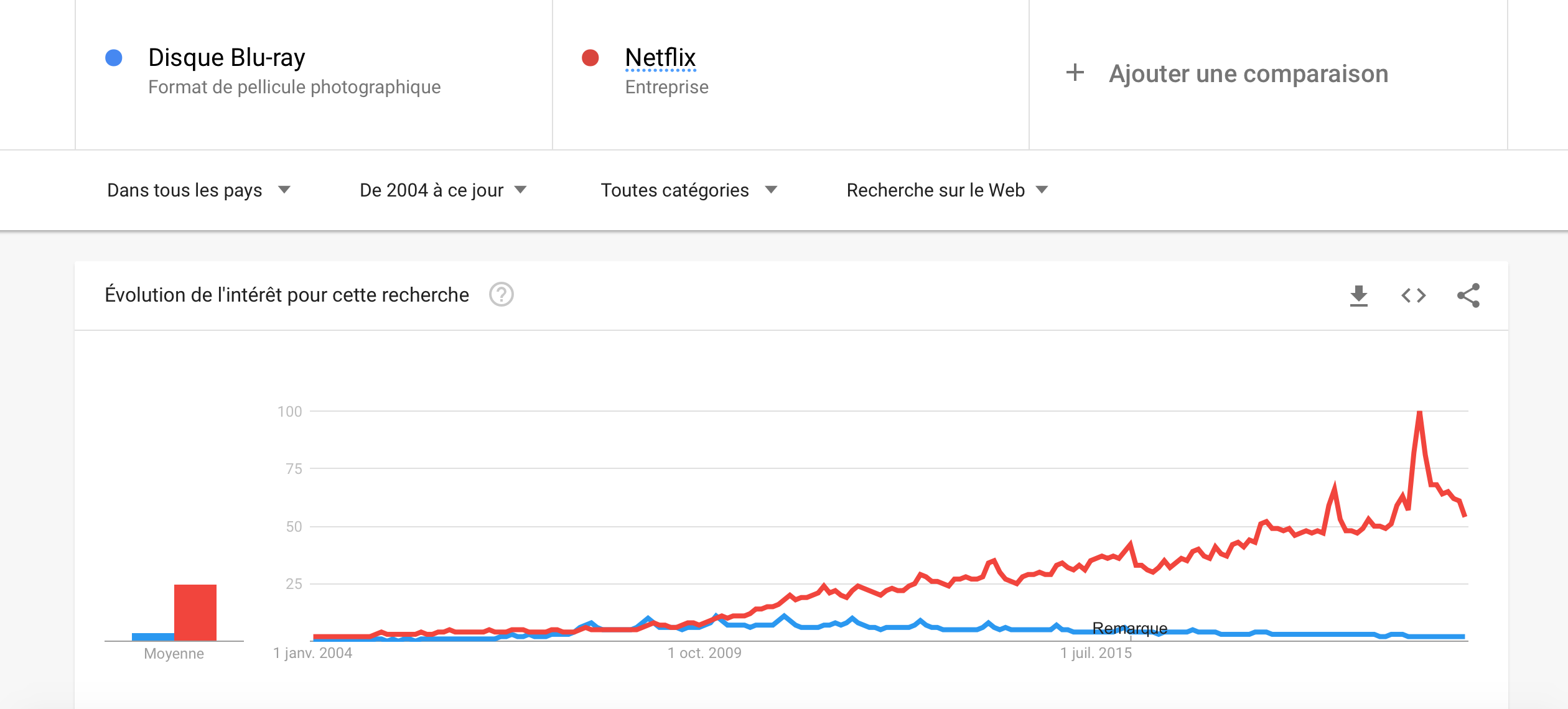
Who remembers blu-rays? This technology was used for a period, but nowadays with the emergence of streaming devices such as Netflix, you will probably make fun of someone asks you to watch a blu-ray with him. With Google trends, we can see the when was the golden age of blu-rays, as that and when it began to collapse.
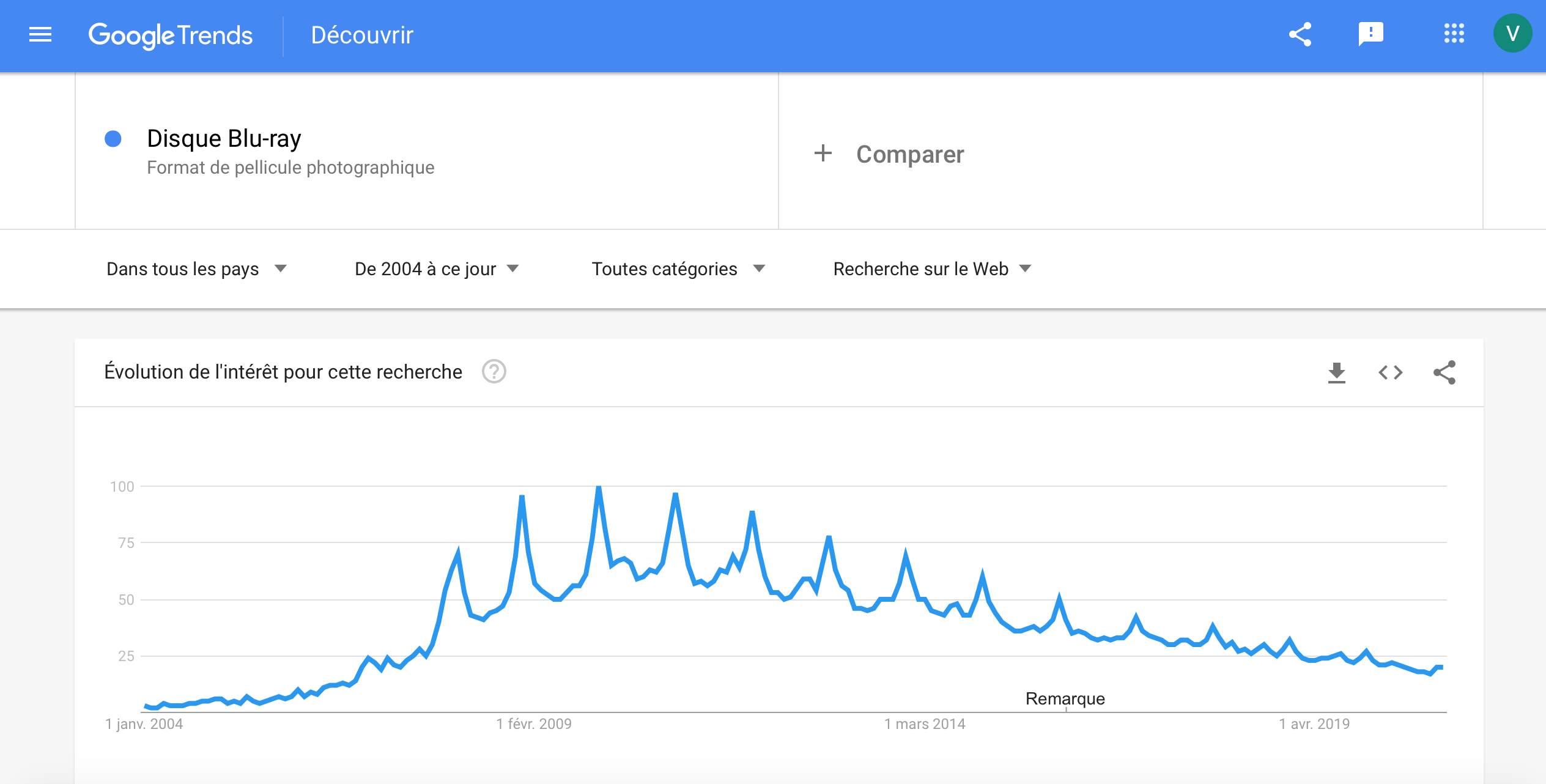
According to Google searches of the term ‘Blu-ray Disc’ in all countries, we can see that the popularity of blu-ray discs was the highest in 2009/2010, few years after its launch, but decreases continuously since these years because of the emergence of new streaming devices such as Netflix.
It is really cool, isn’t it ?
However, manipulating google Trends could be tricky… Indeed, what there are thousand of possible search terms related to a subject, that differs by the formulation, the orthograph etc… So we have to be very careful when it comes to pick a search term to relate it to a phenomenon. Taking the example of the queries related to Employment (a subject that we will talk in detail soon) in France we have the following volume of queries for three different search terms :
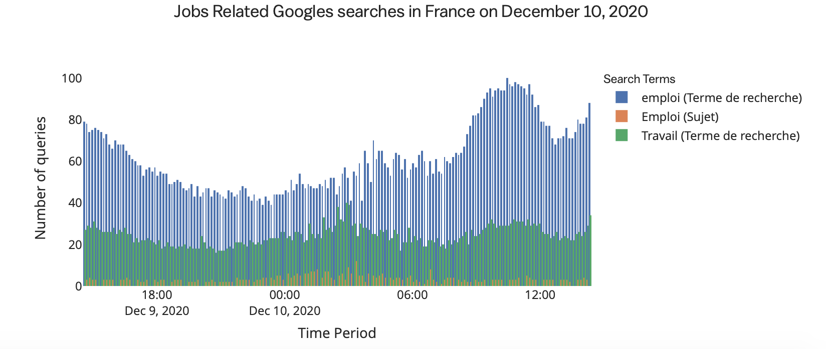
We can see that depending on the word, the volume of queries differ A LOT. That is why it is better when it comes to pick google trends to select categories or subjects rather than search terms, because they will group different search terms and we don’t risk to pick a search term that has not a lot of queries.
2. A data story
Nowadays, we can safely say that job search is one of the main concerns for today’s young people. We’re not talking about a funny subject here, sorry if it’s your concern too, we didn’t intend to remind you that you are jobless ^^. Indeed, the world has entered a new demographic, geopolitical, economic and socio-cultural situation. In this world, employment is an essential element for functioning of industrial societies and of the place of individuals in social relation.
Even if today the society is well-evolved and most of the people benefits to be in good health, educated and trained to a high standard, a lot still struggle to find an employment and get inserted in the society. In this context, it could be interesting to analyze rates of unemployment initial claims to see how much people are searching a job and relate this to a specific period. But, why the unemployment initial claims are increasing or decreasing?
To interpret this, it could be interesting to use Google Trends to predict these observations and find out if they are somehow related to a societal elements (like an economic crisis, a pandemic etc…). The second goal is to see the how reliable this model is, if we can rely on these predictions to adapt political and economic decisions.
2.A. The curse of unemployment
Can we predict how many people won’t have a job tomorrow and will ask for unemployment benefits ? Well, we will try to !
Forecasting is a technique that uses historical data as inputs to make informed estimates that are predictive in determining the direction of future trends. Businesses utilize forecasting to determine how to allocate their budgets or plan for anticipated expenses for an upcoming period of time. This is typically based on the projected demand for the goods and services offered. Forecasting is often based upon a specific period (the passage of the next 12 months) but also on the occurrence of an event, which could be reflected by the Google Trends.
We are using here a simple model called Linear Autoregressive Model
Are you lost because you don’t know what that is ? Don’t worry, we will give some more details.
This model is like a linear regression, but instead of predicting the response (here the initial claims for unemployment benefits) with other observations that might be related to the response , we will predict our response basing us on previous observations of this same observation. So we have the following relation:
where b1 and b0 are the coefficients obtained fitting the model. We will call this the base model. We will train this model for the period between 2011 and 2020.
Once we have this model, it’s time to play with the Google Trends !
We are using here the trends Local/Jobs and Society/Social Services/Welfare & Unemployment for 2 reasons. The first one, these are categories, that means that they identify all the queries that are related to Jobs and Welfare & Unemployment so we don’t have the problem of not taking the right search term to predict the response. The second is that these categories have been identified to be the most useful for this subject.
The trends model look like this :

Now, we will train both models for the period from 2004 to 2011 and predict the initial claims for the same period and we get:
It’s crazy how the predictions are close to the true observation, right ? And we can go further and compute the improvement of the trends model, and the result is that Google Trends improve the predictions about 0.53%. We have not an extraordinary improvement, but it is a good start. Furthermore, we can optimize the model in funciton of two parameters:
- The type of seasonal terms
- The set to train the model
We are going to predict the overall initial claims by using different seasonal terms and find out what are their impact on the prediction accuracy. We are also going to change the size of the traininig set using a rolling window. The principle a rolling window is to use a certain number k of previous observations to train the model predict the next one.
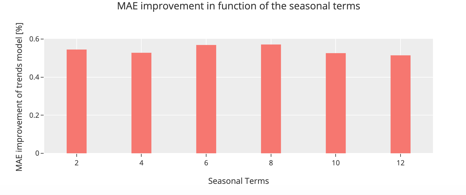
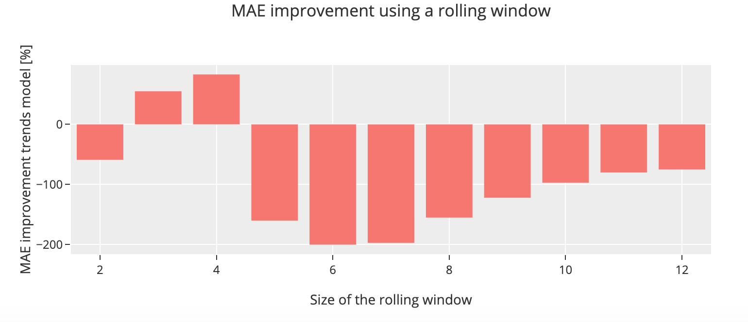
We can see for our initial claims data set that the model using the observations from eight months and using a rolling window of size 3 gives us a better prediction and achieve an overall improvement of 83%. We can conclude from this that manipulate these parameters to assert which one is more appropriate for our dataset is essential and it is specific to the data itself.
2.B. Will we ever get a job some day?
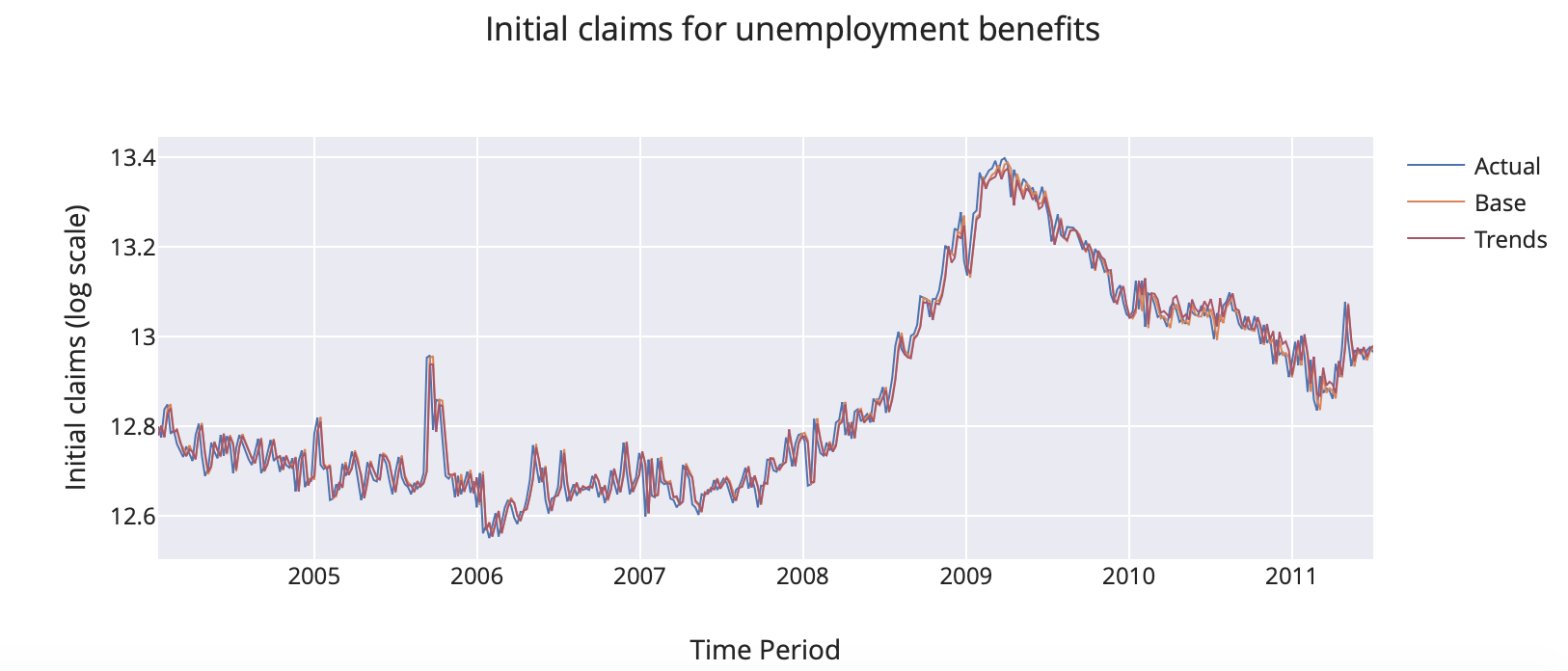
We will now show that it is possible to predict the unemployment rate for the next months, in other words we could almost say that we are trying to predict the rate of people who do not have a very great life at the moment. So if we train the models for the time period from 2011 to 2020 and we predict for the same period we get :
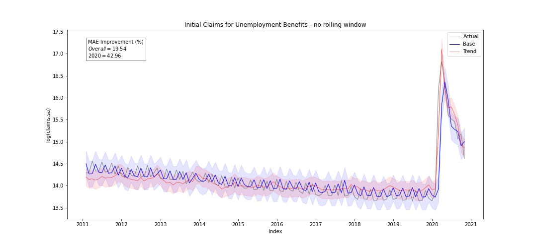
The first thing that we notice is 2020, this sudden increase in the unemployment initial claims. What happened here ? I mean, during the recession there also was an increase where the log of claims reached 14, but here its reaching almost 17 ! And it is safe to say that this might be due to the pandemic. Looking now at the predictions, can see here that the trends model improves the prediction about 19.54% on the overall period and about 42.96% in 2020. From this we can conclude that the trends model helps to improve the predictions compared to the base model.
However,it is very useful to predict a period in which we already know the ins and outs ? In real life, when we try to forecast, we don’t know the response because it’s what we are searching ! So now, we are in december 2019, the New Year comes, everybody is asking you what are you plans for 2020, and you know exactly what it is… your plans for 2020 are to predict the unemployment initial claims ! Will Google trends help you to build a solid prediction for 2020 ? That’s what we are going to find out !
Our base and trends models is now trained for the observations from 2011 until December 2019, and our prediction period will be from January 2020 to November 2020.
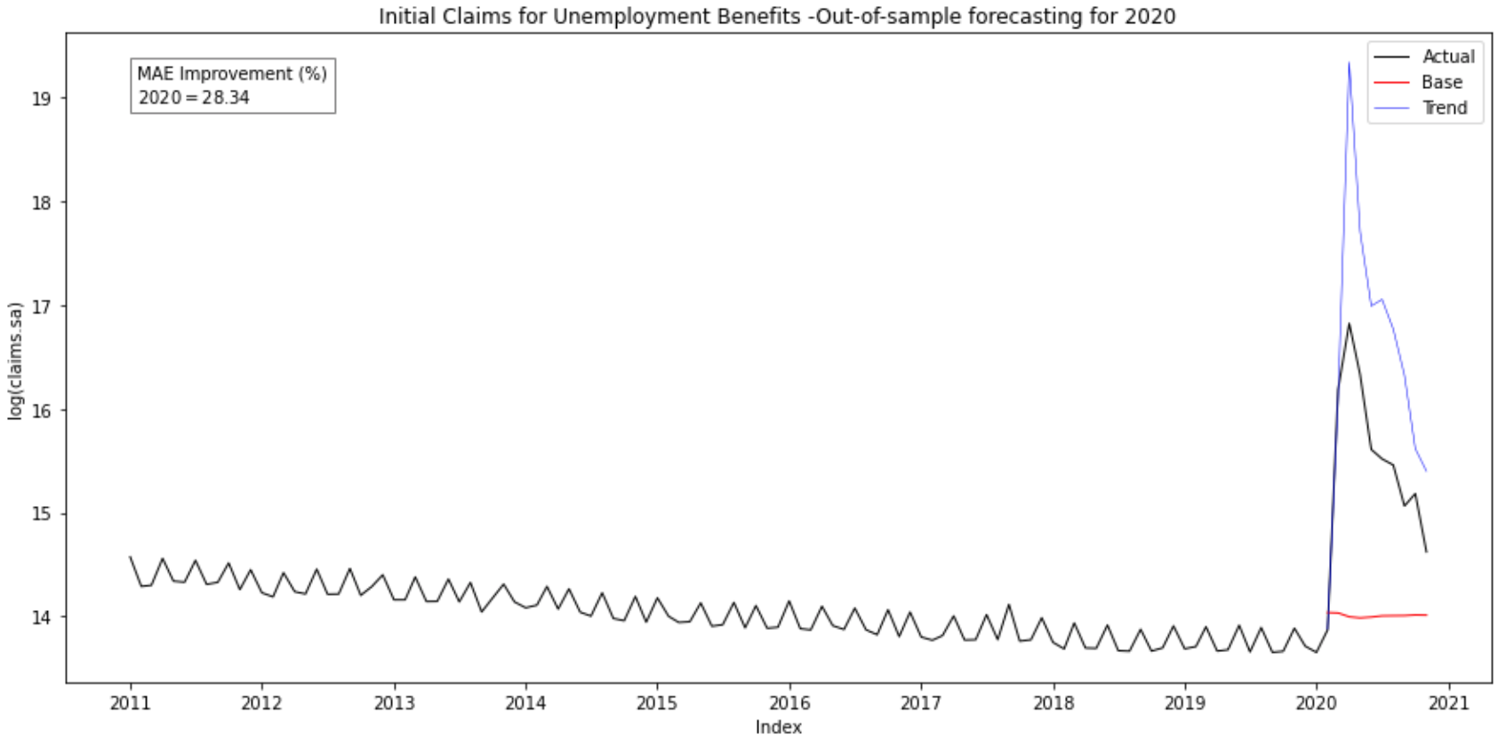
Predicting with an out-of-sample forecast gives an improvement of 28.24% for the trends model compared to the base model. We can clearly see this improvement in the graph, and we can conclude that the base model didn’t foreseen this pick coming ! So that clearly proves that for out-of-sample forecasting, base models are not very reliables… However, even if the trends model is not perfect, it somehow managed to predict this crisis due to the actual pandemic. Why is that ?
Looking at the ANOVA tables of both models, we see that the coefficient for the s1 feature is really small compared to the intercept and the trends features, and its p-value is above 0.05 which means that this term is not very significative to predict the response. That’s could be why the trends model performs better.
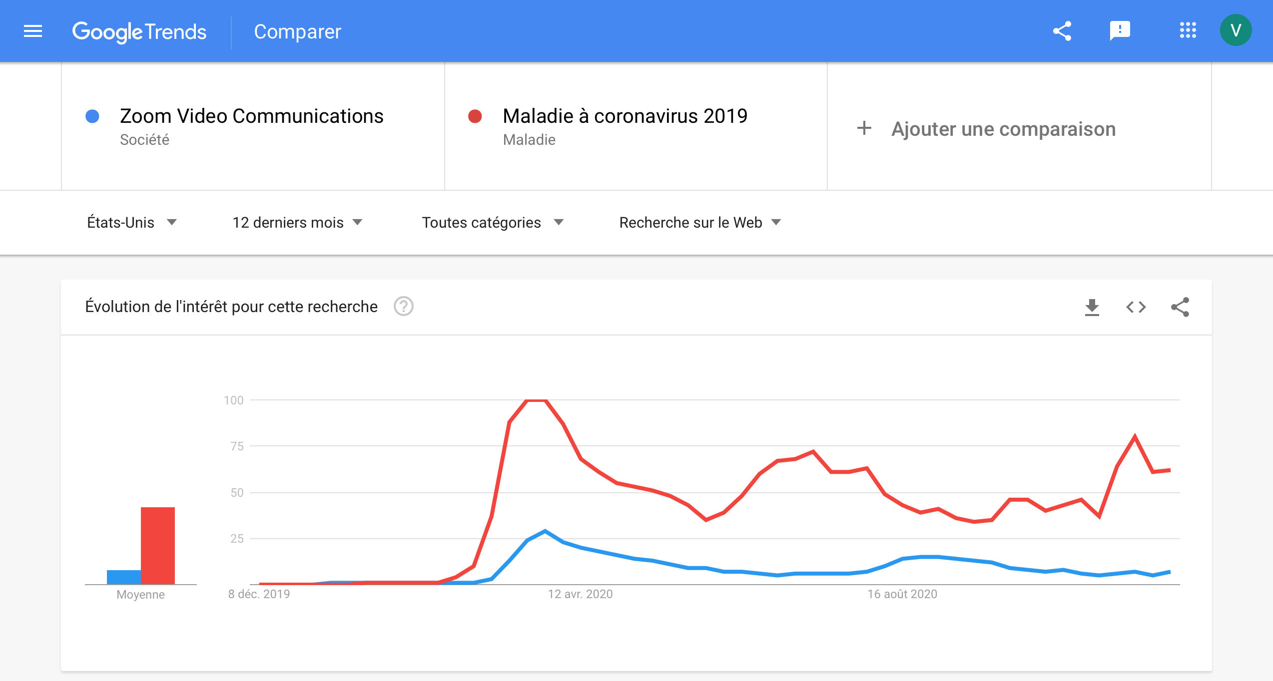
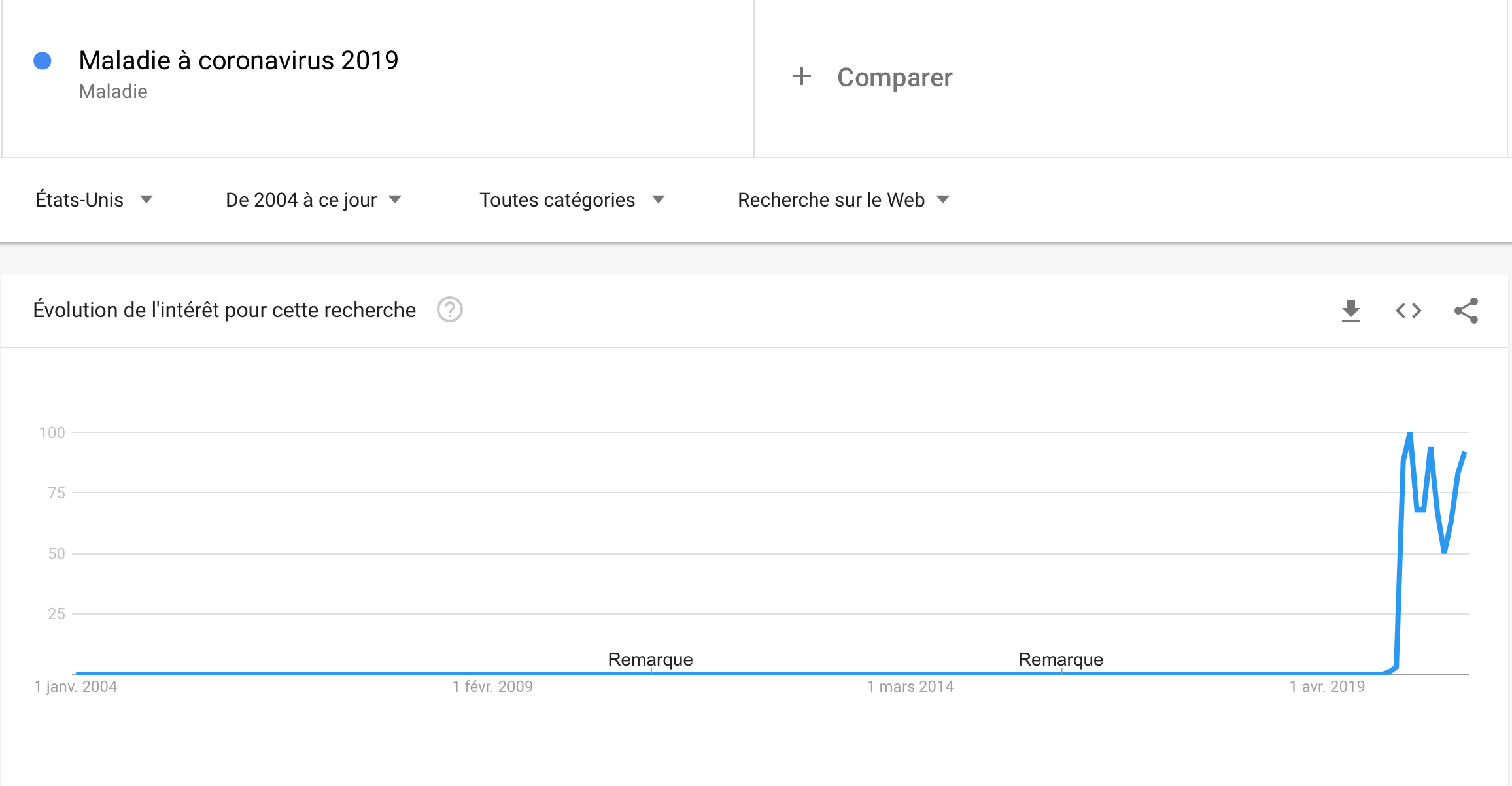
Can we go further ? As this big increase in 2020 is clearly related to the current pandemic, maybe using google trends related to Covid-19 might help us to improve the prediction! Yes, we know, you’re tired to hear about Covid, but it is for a good cause! The idea is to integrate the Google searchis related to Covid-19 and find out if the prediction is better, because these two curves have to following pattern which is very simimilar:
And, effectively, the improvement of the trends model compared to the base model is about 29.52% (and we had before an improvement of 28.34% without the covid trend). We can conclude that it not improves dramatically the predictions, but it does help a little.
However, Google trends are very useful to predict anormal events that are related to a crisis or particular societal events.
3. How do I get the best exchange rate ?
In this part, we will tell another very interesting data story, the one about exchange rates. More particulary, we will be interest in the US/Euro exchange rate (which is currently set to 1.22). Exchange rates are more than just a numerical conversion between currencies. They are a direct consequence, sometimes even trigger elements, to major political and economical events.
3.A. Google Trends and the forecasting performance of exchange rate models
In order to conduct our study of this data set, we used work done by Motoki Masuda and Fumiko Takeda at Department of Technology Management for Innovation University of Tokyo and Levent Bulut at Department of Economics and Finance, Harley Langdale, Jr. College of Business Administration, Valdosta State University, Valdosta, GA 31698, USA and their respective papers :
- Application of Google Trends Data in Exchange Rate Prediction
- Google Trends and the forecasting performance of exchange rate models
We mainly focused on the second paper in which the authors used Google Trends data for exchange rate forecasting and took a sample which covered 11 OECD countries exchange rates for the period from January 2004 to June 2014. By performing an out-of-sample forecasting of monthly returns on exchange rates, they found that Google Trends search query data seemed to do a better job than the structural models in predicting the true direction of changes in nominal exchange rates. Let’s try and see if we come to the same conclusion…
We decided to work only on the US/EU exchange rate whereas the authors of the paper worked on exchange rates for various world currencies.
The first question which comes to our minds is the following : what model are we going to use ? We decided to rely on the model used in the paper, which is a simple linear regression with one seasonal term y(t-1) and the different trends found which are related to the variable predicted.
We will, in addition, use an increasing rolling window with an initial size of 10. This model, of course, is meant to be compared to a base model as in the first part of this extension.
Now that the choice of the model has been established, we must choose the trends we are going to use. In the paper, they suggested a list of fifteen query words which can be fitted in the model. We considered that using four of them would be enough to get a good prediction and we chose the following ones : Inflation,Prices,CPT and Cheap.
We began to work with five data sets. One of them is simply the US/EU exchange rate dataset for the last twenty years and the four other ones correspond to the chosen Google Trends. Each of these four data sets contain the number of queries for the four trends in a specific country, the US and 3 major European countries/regions (Great Britain, Germany, France).
Preprocessing work
As each of these four datasets correspond to a specific countries, the features names were not all in English. Therefore, a preprocessing task was to translate all the features names of those datasets in English.
Some columns of those datasets as Inflation and CPI contained string values as <1. As the other values in those columns were generally much bigger, we considered that a value of <1 corresponded to 0.
Since our goal is to work on the US/EU rate in general, meaning that we consider the EURO zone as a single zone, we did the average of those three European countries datasets and we used the result dataset as our European dataset.
Finally we created our final dataset. In this dataset, we considered that the trends columns would be the difference between the number of queries in the US and the number of queries in Europe. Indeed, we considered that the difference between those two world regions would be more relevant for our analysis. It will allow to really see where between the US or in Europe, a query for a specific Google trend has increased. After that, we merged the US/EU exchange rate obtained on the internet and the “differentiated” Google trends dataset.
Now the real analysis can begin !
Let’s recap the model we will use here :
Trends model :

Base model :
As previously mentioned, the type of forecasting we perform is an out of sample one and we use an increasing rolling window of initial size 10. We considered this size of rolling window enough since we only have one seasonal term at time (t-1).
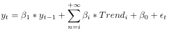
So, we train both models with a sample of fixed size and we predict the next value. The size of the sample increases at every incrementation, therefore, at the end all values have been predicted. By training both models for the overall period from 1999 to 2020 and predict the US/EU exchange rate for the same period and we get the following results :
By looking at this figure, you may think that the predictions made by the Google Trends are not very good. Well, let’s take a closer look at the figure. We notice that on the increasing portions of the figure, the predictions made by the trends model seem to fit the actual data very closely whereas on the decreasing portions of the figure, the predictions are completely false. We will try and explain this observation later on.
When computing the improvement of the trends model, we get that Google Trends improve the predictions by 8.75 %. This is far from insignificant and it is consistent with the assumption that Google trends greatly improve the US/EU exchange rate forecasting.
In order to get another comparison basis, we predicted our data without a rolling window. Since, it is in-sample forecasting, the results are not as relevant as the first predictions. However, we still can see that the trends model gives us a better prediction than the base model since the MAE improvement, in this case, is around 1.5 %.
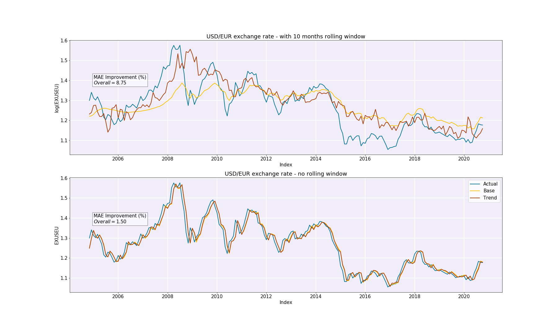
3.B. Let’s take a look at the financial drops
The interesting thing here is to look at the drops on the figure. There are three very noticable drops, one in 2008 (this one is expected), one in 2010 and one in 2014.
What happenend during those three time periods ?
-
2008 : The dollar strengthened by 22% as businesses hoarded dollars during the global financial crisis. By year’s end, the euro was worth $1.39. Since the euro crashed (the euro was worth $1.44 in December 2007 !), the US/EU rate decreased dramatically.
-
2010 : the Greek debt crisis strengthened the dollar. Remember, the Greek debt crisis is the dangerous amount of sovereign debt Greece owed the European Union between 2008 and 2018. In 2010, Greece said it might default on its debt, threatening the viability of the eurozone itself. By year’s end, the euro was only worth $1.32. Since the euro crashed, the US/EU rate decreased dramatically (euro currency was getting cheaper to buy).
-
2014 : The euro-to-dollar exchange rate fell to $1.21 thanks to investors fleeing the euro. Hopes for a sustained rebound in Europe have been dashed by anemic economic readings and up-and-down tensions with Russia over the future of Ukraine. Europe faced what was called the Putin effect which is when Russia responded to U.S. and European sanctions with sanctions of its own, including ones banning the import of food from Europe for a year.
What about the sudden increase before those drops :
-
2007 : The dollar fell by 40% as the U.S. debt grew by 60%. Since the dollar crashed, the US/EU rate increased dramatically.
-
2009 : The dollar fell by 20% thanks to debt fears. By December, the euro was worth $1.43. US/EURO dollar. Again, since the dollar crashed, the US/EU exchange rate increased dramatically.
-
2013 : The dollar lost value against the euro, as it appeared at first that the European Union was, at last, solving the eurozone crisis. By December, it was worth $1.38. Due of the lost of value of the dollar, the US/EU exchange rate increased.
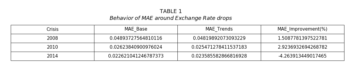
By predicting the US/EU exchange rate only on those specific periods, we get very interesting MAE values.
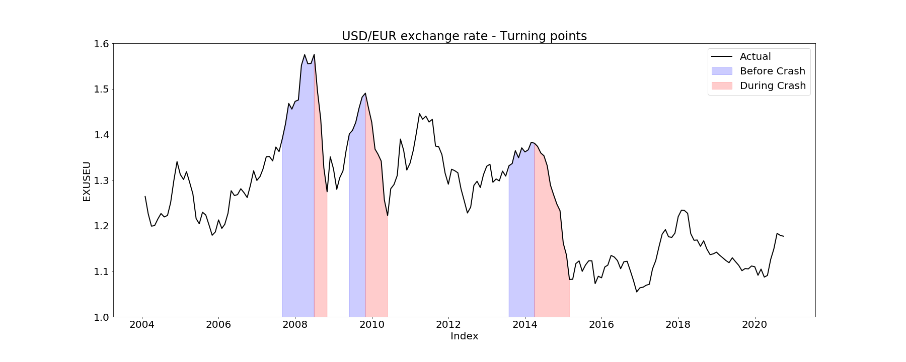
2008 crash : The MAE improvement before the crash is about -2.73 % whereas the MAE improvement during the crash is about -4.44 %. Even though those improvements values tell us that the trends models did not really improve the predictions for the 2008 crash, we can still clearly see that the prediction before the crash is much better than the prediction during the crash.
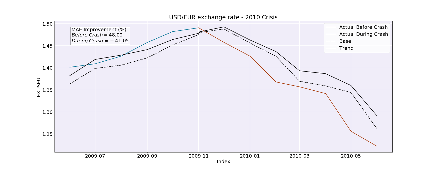
2010 crash : For this time period, the difference between the MAE improvement before and during the crash is quite striking. Indeed, the MAE improvement before the crash is roughly 48 % whereas the MAE improvement during the crash is -41.05 %.
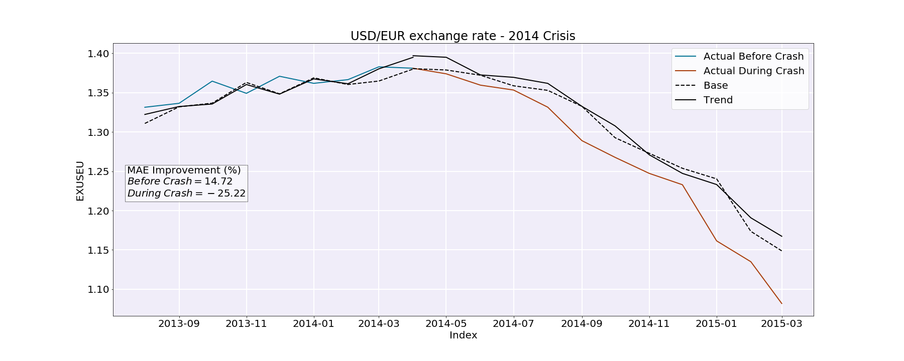
2014 crash : Here, the difference between the MAE improvement before and during the crash strikes us as well. The MAE improvement before the crash is roughly 14.7 % whereas the MAE improvement during the crash is -25.22 %.
Why would our model predict better before the crash rather than during ? First of all, let’s think about the variation of our trends before and during the crashes. As mentionned before, when the exchange rate increases, it means that the dollar has crashed. The import in the US becomes very expensive, people lose their purchasing power, they can not afford foreign products anymore, least of all travel. Therefore, it seems logical that people in the US would inquiry more terms like Prices,Cheap etc… If this is the case, then the difference between the US queries and the European queries will increase.
On the other hand, during all of the concerned crashes (decreasing portions), the EU currency has crashed. As a consequence, the exchange rate has decreased. In that case, it is the import cost in Europe that becomes higher, the people loose their purchasing power and they do not have the financial means to travel anymore. Here, it seems logical that the European people would inquire more terms like Prices,Cheap etc… Therefore, the difference between the US queries and the European queries will decrease.
Now how is this related to the fact that our model predicts better before the crash rather than during ? Well since they are more increasing parts than decreasing parts in our dataset, our model is mostly trained on increasing parts. Thus, the coefficients attributed to the features are trained on relatively high exchange rate values. Moreover, the drops are ponctual. The model is, thus, less kean and adapted to set the coefficients based on these events.
How can we improve our model ? The next step of our work was to try and see which trend had the greater influence on the predictions. What we wanted to do was to improve the prediction over the drop periods using the google trends. A way to do so is to analyse the correlation between the exchange rate and the trends over the crash periods. A negative correlation would indicate that the trend impacts negatively the prediction, i.e if the exchange rate drop the queries for the trends in Europe increases compared to US. Thus, using the correlations, we may find trends that are the most likely to predict accurately the drops.
Here are the results of the correlation between each trend and the US/EU exchange rate for the 2008 crash (during the crash) :
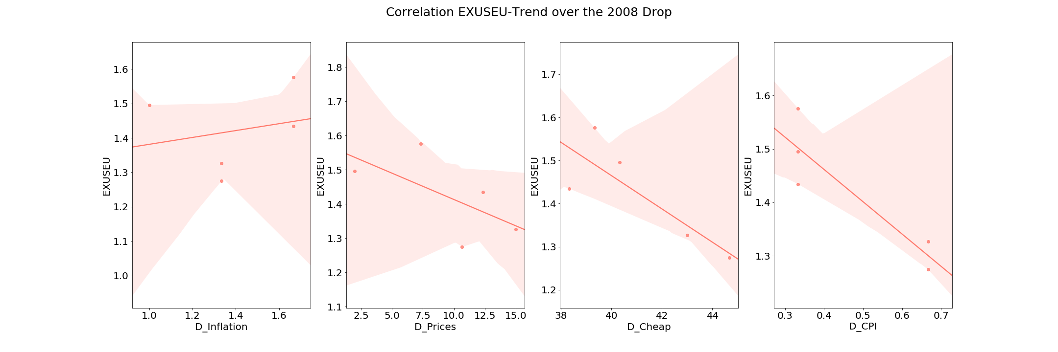
The trend Inflation is positively correlated to the exchange rate uring this drop period. We are going to try to conserve only this feature for the prediction of drops to see if we can get a better improvement compared to the baseline model.
We can see that for the 2008 and the 2010 crashes, the MAE improvement is positive (they were negative before). This tells us that the trends model predictions are much better. The MAE improvement for the 2014, still remains negative. However it is “less” negative than before (remember the MAE improvement during the crash was equal to -25.22 %). Lastly, we tried to make the predictions without the trend Inflation (just for the 2008 crash) to see how the MAE scores changed. The MAE improvement before the crash is roughly -2.73 % whereas the MAE improvement during the crash is -7.24 %. This value is much worse than the one we got when predicting only with the Inflation trend. Thus, we can conclude that the Inflation trend is the most accurate and relevant trend for this model and removing the others greatly improves our model predictions.
Conclusion
Through this data story, we have learned many things about forecasting the present with Google Trends. First, we’ve learned how to optimize the parameters in order to improve the prediction of an observation for the next few months with out-of-sample forecasting. This seems to be a very promising tool to upgrade the forcasting using autoregressive terms. Then, we have seen how to manipulate Google terms and to what extend some of them are useful for this type of models, as we were bound to pay attention to the popularity of the search terms that we wanted to use in order to get better results. Finally, we have seen the limits of these models, as the use of Google trends seems to improve the performance when the observations follow a certain allure (like an sudden increase). In fine, we have made a generalization of forecasting methods using Google Trends and we have seen through a very specific example that these kind of models are useful even when the observations are kind of unpredictable since those observations result from particular events or contexts which are very well reflected through Google Trends data.